This post first appeared on Risk Management Magazine. Read the original article.
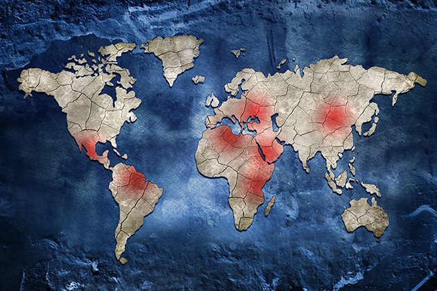 Country risk maps are a type of infographic developed by consultancies and insurance firms that shows how exposed countries around the world are to particular threats such as political instability, terrorism or crime, among others. In some cases, the maps assess an aggregate risk like security or travel risk, both of which have many component elements. These maps are indeed useful snapshots of global issues, but as they grow in popularity, consumers also need to be aware of potential flaws in their methodology.
Using Country Risk Maps Effectively
Country risk maps can be utilized by a variety corporate functions, from government affairs to legal and compliance to security departments. They primarily serve as a handy guide for quick comparisons. A map might show that political stability in Finland is similar to that of New Zealand, or that security risk in Bolivia is on par with that of Tanzania. This function should not be underestimated since putting country risk in global context is a form of benchmarking that can guide further analysis.
Some of the specific ways an organization could leverage such maps are:
- Travel risk management. The focus of many risk maps on security and terrorism makes them ideal tools for assessments of travel risk. In fact, a 2016 survey by the market research firm Ipsos MORI found that some 32% of surveyed companies changed travel itineraries due to country risk ratings. Some travel risk managers may also use the ratings to suggest additional precautions for travelers or even add a layer of physical protection for employees.
- Government relations. Many country risk maps measure or try to forecast political stability, a feature that can be very useful for managing risk within government relations departments. Such units are dependent on a certain level of political stability to effectively carry out their work and should a foreign regime topple, their work in building contacts at all levels of the government may come apart with it. Risk maps can therefore help government affairs units assess political risk across a company’s global footprint.
- Corporate security. Besides relying on country risk maps to provide them with overall risk levels for operations or assets globally, corporate security departments can benefit from the “incident collection” feature of many risk maps. Instead of relying on expert opinion to determine overall risk levels, some maps create risk ratings based on the number of recorded total incidents of terrorist acts, burglaries, homicides and other potential threats. Corporate security divisions can use this data to decide how security resources and technology should be allocated.
- Reputation risk. While reputation risk may seem like an issue that is particular to each company or organization, risk maps can help here as well. Some country risk ratings consider the potential for social unrest. A population that is already predisposed to demonstrations is more likely to take notice and action in regard to any missteps a company might make.
- Corporate strategic planning. Some country risk maps use rigorous quantitative analysis methodology—including weighing variables and using highly comparable data globally—to create their risk scores. These elements make such maps ideal inputs into broader quantitative models used to determine long-term corporate planning and investment.
Potential Drawbacks
While country risk maps can be used as the basis for a number of important decisions, the way they are created can reveal flaws:
Expert Opinion
The most basic methodology for creating a country risk map is to mine the brains of experts who can determine where risk levels are lowest and highest. The advantage of this methodology for firms is obvious: Leveraging expert knowledge requires the fewest resources and is by far the fastest approach. For consumers, maps that draw exclusively on expertise are more likely to be varied, since expert knowledge can fill in gaps on topics that do not lend themselves to data analysis. Moreover, the experts may, in theory, have a higher level of knowledge than any particular sources or datasets.
When it comes to standard political or security risks, however, recipients of expert-drawn maps should be careful. One concern is that expert views can be subjective and that the analysts are weighing apples in one country against oranges in another without regard for consistency. And who are the individuals making the maps? In many firms, they are assistants to the experts or worse yet an army of interns. It is also worth noting that even when the true experts make the final call on a country risk rating, the result may not be much better. The unfortunate truth is that most political risk consultants failed to predict President Donald Trump or “Brexit.”
Data Analysis and Indexes
Another key methodology for making risk maps is to aggregate quantitative data or make an index. The country score that comes out of this process is then used to color countries on a scale. This is definitely seen as a more rigorous approach, and with good reason. Not only does the method rely on hard data that is consistent and comparable globally, but it often uses sophisticated mathematical techniques.
The quality of these maps, however, depends strongly on the data sources used. In the case of political and security risk, high-quality numbers can be difficult to come by. Global crime data, for instance, might be publicly available but only for different years. And even if the latest data for the same year is found through local law enforcement, country definitions of the same crime may vary. When it comes to political risk (which is traditionally seen as more qualitative), quantitative analysis sometimes relies on hazy proxy indicators—using the number of peaceful transfers of power after elections to stand for political system stability, for example.
Experts play a role here too. When a country risk index is composed of multiple variables, companies may quantify an analyst’s opinion on an indicator for which they cannot find good data. The political stability score mentioned earlier might be one such variable. Analysts also frequently have the final say at the end of the process. If one country’s score seems too low compared to another, either the data set or certain variables will be tweaked accordingly to meet a “common sense” test. The end result, however, is a map with few surprises since experts made sure that the final scores matched preconceived notions.
Incident Collection
When existing data is lacking and experts are unable to offer their opinion on a political or security risk topic, firms turn to incident collection for their risk maps. The idea is that real-time data entry of events—be they incidents of terrorism or national referendums—can provide risk maps with an unimpeachable basis. Indeed, it would be difficult for a critic to argue that a country with 37 recorded incidents of terrorism in the last year is less at risk from terrorism than one with five.
But here, as elsewhere, the methods reveal potential weaknesses. If the incidents are being collected by individuals, there is always room for error. No matter the size of team involved, there is always the possibility that incidents of a particular risk are not mentioned in the media sources being monitored or even the possibility that an incident is not covered at all. Some companies have eliminated employees from the monitoring process almost entirely, relying on technological means to track and record incidents. This system is not foolproof either as few technologies have the sophistication to provide a complete global record. Sometimes, search algorithms make mistakes, such as recording shooting incident in the Georgetown neighborhood of Washington, DC as having occurred in Georgetown, Guyana, for example.
Whither Country Risk Maps
The way risk maps are created can often make them inconsistent and leave significant room for error. But companies that create country risk maps are constantly refining them to be more interesting, robust and unassailable. For these reasons, and the obvious one that risk maps are a highly useful infographic for risk managers and others with responsibilities related to risk, country ratings and maps are here to stay.
Maps that are based on incident collection are utilizing increasingly advanced technology and firms creating these maps are now engaging with tech companies that can collect data better than they can. Some companies are even using predictive analytics. At the same time, political and security risk consultancies that leverage indexes for their maps are now hiring “quants” to a level previously seen only in the financial or management consulting industries. Even qualitative country risk maps are being refined, as firms increasingly rely on structured analytic techniques to lessen the chances of arbitrary judgments.
All of these improvements are leaving the average country risk map consumer better off than before with products that have become more useful with each passing year. It is important, nonetheless, to recognize that country ratings and maps should be used only as a starting point, since most political and security risks cannot be boiled down to a score or a color. When working with firms that offer risk management in these fields, decision-makers should follow up with demands for tailored intelligence or consulting. Customized work will take into account the specific needs of the client, whether the issue is travel risk for individual employees or regulatory issues across a company’s global footprint. At the very least, leaders across all the corporate functions should ask “how the broth is made” to understand both the positives and negatives of the country risk maps they refer to every day